

This study was done as part of a course by General Assembly. The challenge was to design a website for a startup that wants to help people find jobs. My users would need to be able to find relevant jobs, submit their information, and track their applications.
When applying for jobs, candidates struggle with three critical challenges: unclear communication from recruiters who often ghost applicants, difficulty identifying jobs that match their qualifications, and no centralized way to track multiple applications. This creates a frustrating, anxiety-inducing experience that extends the time it takes to secure employment. The goal of my research was to build a platform that addressed these pain points and create a smoother, more seamless experience for job-seekers in finding the right career opportunities
I began my creating a research plan for what type of user research I would conduct and then drafted a discussion guide of interview questions to help guide my interviews with users. I then created an affinity chart of my findings, synthesized that information into a user persona, and used that persona as a guide to create a prototype of the platform.
My target user group was people who were looking for a job, either due to unemployment, looking to start their careers after college, or looking for a career switch. From my research, I wanted to find out what their experience was like searching for and applying to jobs, what their biggest pain points were with this process, and what additions and improvements they would want to see from a job application platform compared to existing platforms.
I decided to conduct face-to-face interviews as they allowed me to observe verbal, as well as nonverbal, emotional cues. I was looking for very clear emotional reactions, as those would point toward the user needs and pain points that needed the most attention.
I interviewed three different individuals who were looking for work due to layoffs, all of them male and in their 20s-30s. I was not able to meet with one of the participants face-to-face due to proximity, so we instead conducted our interview over Zoom.
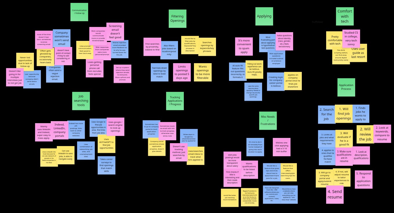

From these interviews, I uncovered a few important trends. The main overarching trend that came up throughout my interviews was a desire for more clear, personal communication with employers. 100% of the users were frustrated when they were not given a clear answer from recruiters who often ghosted them or gave them vague feedback regarding their rejection. They did not enjoy the experience of receiving an impersonal screening email and wanted more intimate communication with the individuals who were evaluating their applications. This was by far the biggest pain point and user need that was expressed throughout my research.
"I just want to know where I stand. Even a rejection is better than wondering for weeks."
They also expressed the need for better job recommendations that matched their qualifications, with one interviewee stating the pain point of not knowing what the job qualifications were on a job listing from the get-go. Another interesting trend was the desire for resources that helped them with finding, applying, and interviewing for job opportunities.
"It would be cool to have a feature that gives tips and tricks about how to apply, search, and prepare for a job. I feel like that would help me in successfully getting the job I want"
When asked about what improvements they would like to see in a job searching platform, answers included better search filters based on qualifications and keywords within the job listings themselves, as well as the ability to edit resumes for specific job listings.
In regard to tracking applications and watching their progress, all users often mentioned just using email to keep track of different applications they had applied to. This reflected the need for a dedicated space where users could easily track all of their applications in one place.
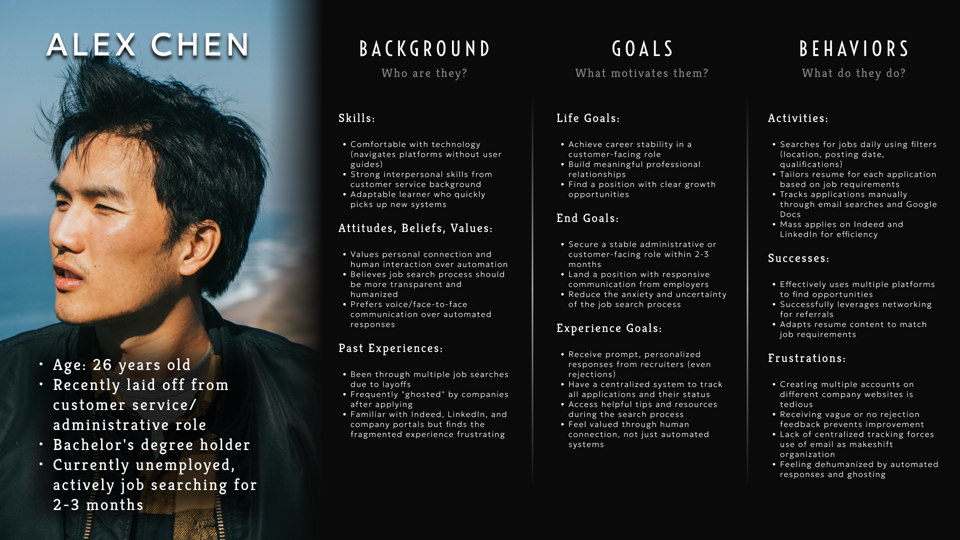
Using this information, I created a persona that reflected the users' needs and would guide me in the next step of designing the platform.
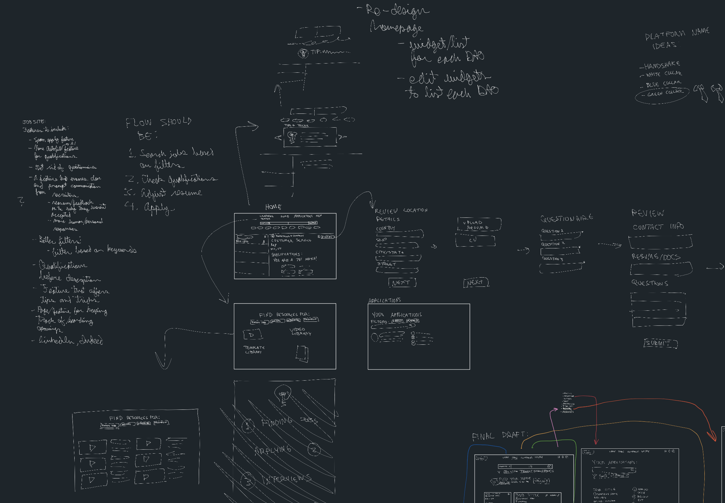
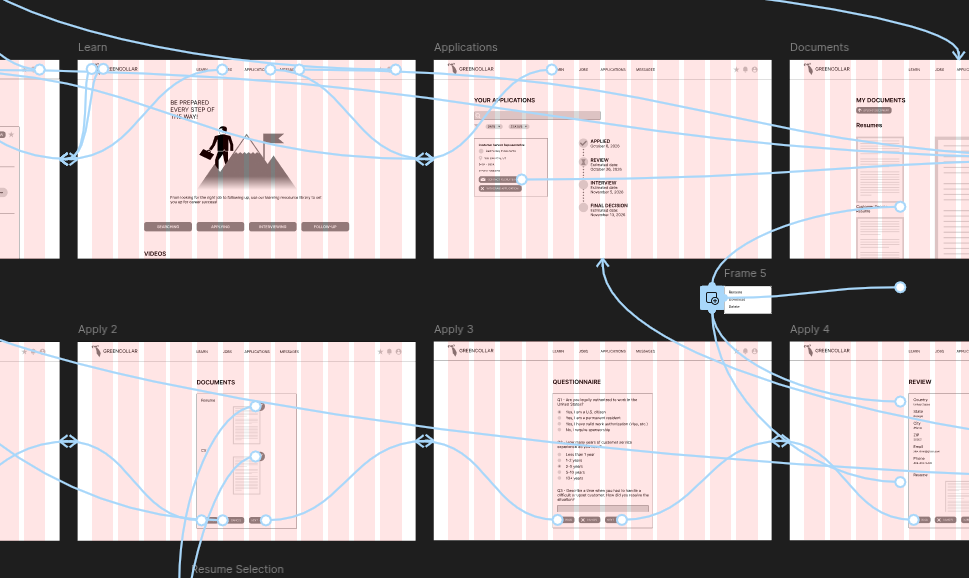
While I did use existing job sites such as Indeed and Glassdoor as inspiration for my design, I made some adjustments of my own using the persona I had created. To help fulfill the user need for clear and timely communication from employers, I added a "responsiveness score" for each employer listed on the website, indicating how effectively and efficiently they communicated with applicants. This feature would not only notify applicants of how soon they could expect recruiters to respond to them but would also encourage employers to respond to job seekers more quickly so their score would look better, serving as a form of social reinforcement. I also included a page specifically for messages between applicants and recruiters and added links throughout different parts of the website to encourage users to reach out to recruiters.
To help users with tracking application status, I added an applications page showing all the applications a user had applied to and the phase the application was currently in, including estimated dates of when each phase would be expected to be completed. This feature was designed to address users' anxiety when it came to waiting for a response on an application and gave them a sense of assurance throughout the job searching process.
In regard to the need for resources and learning materials, I included a dedicated learning and resource library containing videos, documents, and templates to guide and inform job seekers throughout each step of the process and help them succeed with finding work.
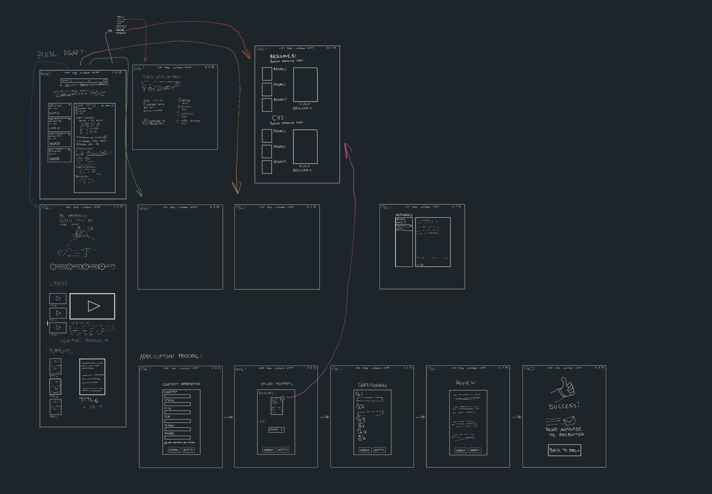
With these sketches, I created a rudimentary interactive wireframe in Figma of how the website would look and function.
Due to the project timeline, I conducted limited usability testing with one participant who navigated the prototype successfully. In a real-world scenario, I would conduct usability testing with at least 5-8 participants to identify usability issues and validate design decisions. Specifically, I would test:
• Whether the responsiveness score feature is immediately understood
• If users can easily navigate between job listings and their applications dashboard
• How intuitive the messaging interface is for contacting recruiters
• Whether the resource library is discoverable and valuable
This represents a key area for improvement in future iterations, as usability testing is essential for validating assumptions and uncovering issues that may not be apparent during the design phase.
While I am happy with the final prototype, I feel like the result was a bit too similar to existing job search sites. Platforms like Glassdoor already have a learning resource site similar to what I included in my product, albeit it is not as visible on Glassdoor. Although my product includes features that drive and encourage better communication and engagement from recruiters, other products offer personal services to help users improve their resumes and increase their chances of getting better employment.
In retrospect, I wonder if there was something else I could have implemented that both addressed the user need for better communication while also helping it stand out from existing alternatives. This is something I will need to explore further in future iterations.
Due to time constraints, I did not design my product for mobile platforms. My target users also commonly utilized job searching websites via desktop. Regardless, I recognize that mobile is a popular platform of choice for many users and will be something I will need to include in future iterations as well.
If this platform were implemented, I would measure success through the following metrics:
• Net Promoter Score (NPS) for overall platform experience
• Percentage of users who actively use the messaging feature to contact recruiters
• Resource library engagement rate (views, downloads, time spent)
• Average employer response time compared to industry benchmarks
• Percentage of applications that receive any response (vs. being ghosted)
• User-reported anxiety levels before and after using the application tracking feature
• Time to complete job application from search to submission
• Application completion rate (started vs. submitted)
• Return user rate indicating the platform meets ongoing job search needs
The responsiveness score's success would specifically be measured by tracking whether employers with lower scores improve their communication patterns over time, validating my social reinforcement hypothesis.
This project helped me recognize the importance of grounding design decisions in user research. The responsiveness score feature, my most innovative solution, emerged directly from listening to users' frustrations about communication gaps, not from assumptions about what they needed.
If I were to do this project again, I would prioritize three things: conducting research with a more diverse user group to capture a wider range of job-seeking experiences, conducting comprehensive usability testing earlier in the design phase, and brainstorming other alternative solutions that address the communication problem in ways existing platforms haven't attempted.
The most valuable lesson from this project was recognizing that good UX design isn't about adding more features; it's about solving the right problems in meaningful ways. While my platform shares similarities with existing solutions, the responsiveness score represents a shift toward holding employers accountable for communication, which current platforms fail to address. Moving forward, I will continue refining this approach and exploring how design can create more transparent, respectful experiences for users.